
dtl CompareMaster
dtl CompareMaster (cpma) is a compact and handy application for comparing contour descriptions, metrics, and glyph hinting between OpenType cff fonts (.otf).
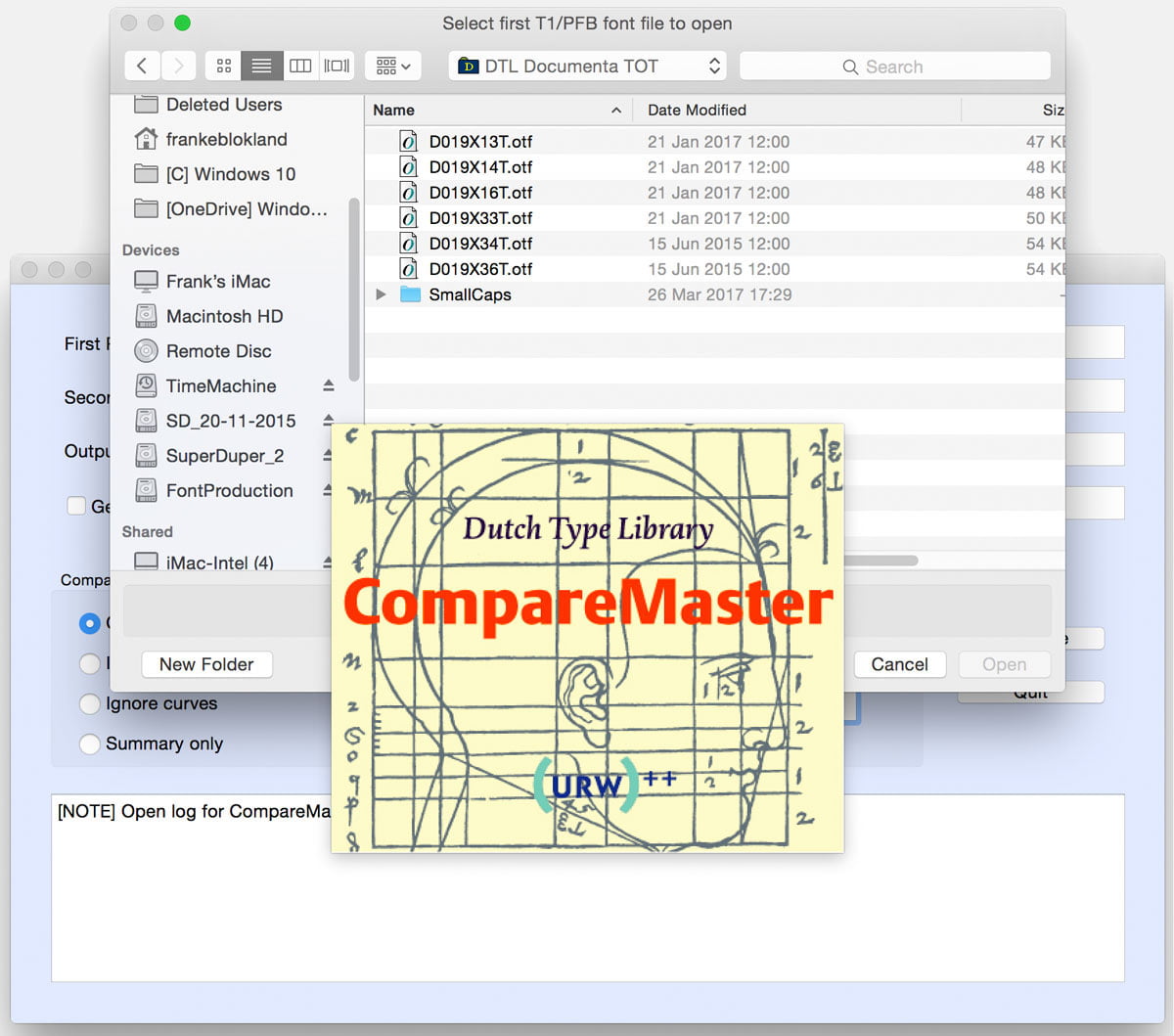
Besides, cpma can also be used to compare PostScript Type 1 fonts (with each other or with OpenType cff fonts). The application is very easy to operate through a simple interface. The first edition of cpma was developed in 2007 for comparing ps Type 1 fonts (used as intermediate format for the OpenType production at dtl). Since then, a retail version has been developed that supports OpenType cff fonts and support for Retina displays has been added. Also there were some enhancements made for, for example, the support of long, i.e., 31+ character names.
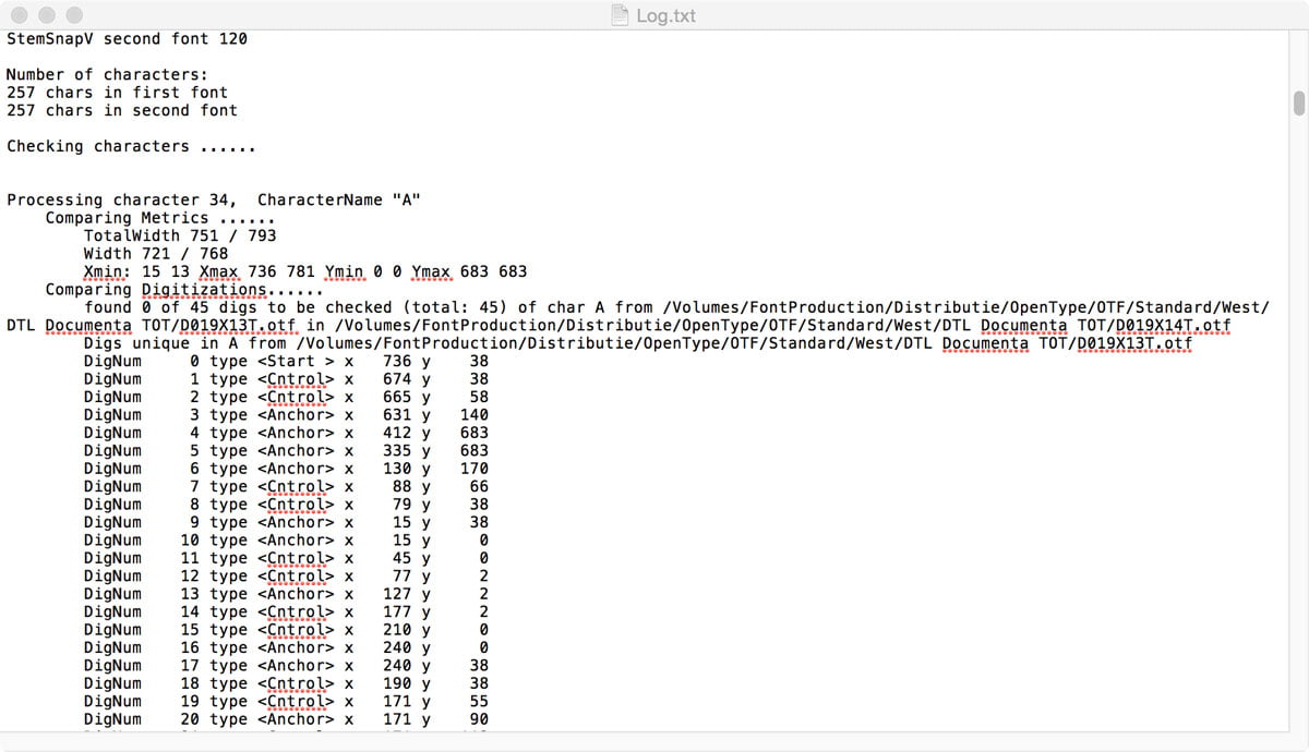
cpma produces an extensive list or a more compact summary of the results as a generic text file. It is also possible to generate plot files in PostScript format. In this way, different fonts, different versions of the same fonts, and releases in different formats can be compared.
As mentioned, dtl CompareMaster offers the possibility to compare font modifications with their origin. This is particularly useful not only for font designers and font producers, but also, for example, for design agencies and printers who want to rule out incompatibilities between different versions of fonts used.
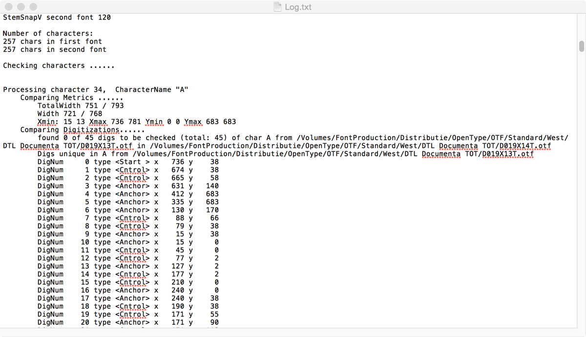
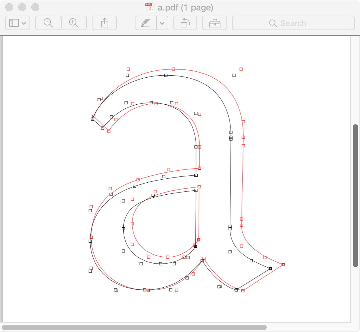
The PostScript plot files show both compared contours on top of each other. The comparison can be applied to a full font or to selected characters (via their ps names: so, for example, type ‘asterisk’ instead of ‘*’). The plot files can be opened in, for example, Preview for macOS. One option for Windows is to use the free downloadable Gimp application.
Availability
dtl CompareMaster is available for macOS, Windows, and Linux. Free ‘Light’ versions can be downloaded from the ‘Test/Demo’ page on this site.
dtl LetterModeller
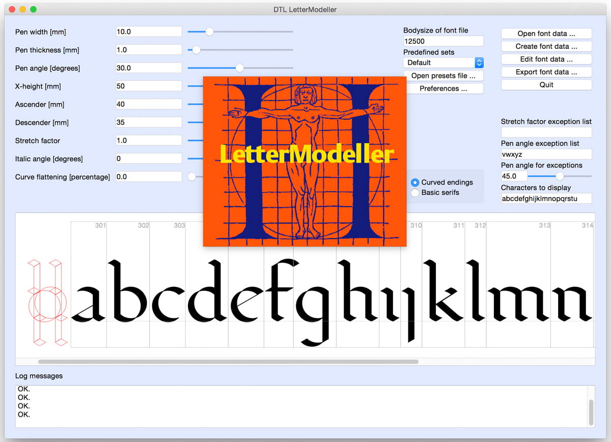
LetterModeller (LeMo) is a first step towards automation of typing processes. The application was developed by Dr. Frank E. Blokland, Dr. Jürgen Willrodt, Hartmut Schwarz, and Axel Stoltenberg with a view to the exploration and parameterization of (certain parts of) type design processes. The application is partly the result of the PhD research of Blokland at Leiden University into the (effects of) systematization, standardization and unitization in Renaissance font production.
LeMo is part of Blokland’s educational program and is based on his expertise as Senior Lecturer of type design at the Royal Academy of Art in The Hague since 1987 and as Research Fellow at the Plantin Institute of Typography in Antwerp since 1995. The models generated with LeMo can be used as a direct basis for typeface design, or as a complement to writing with a broad nib and flat brush.
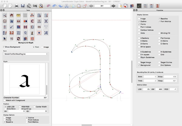
The current version of LeMo can be used to explore and modify the structure of roman type by applying a set of parameters. The generated glyphs can be modified using the internal glyph editor and the results exported in the be (proprietary cubic Bézier) and ufo formats, and as –currently unhinted– cff and TrueType flavored OpenType fonts.
LeMo preferably requires a bigger screen estate: this implies that the display of many functions is not really optimized for laptops. For example, when working with a MacBook, it is recommended that one changes the size of the icons to make every function on the screen accessible.
Moreover, for hinting, it is recommended to use the autohinter in the afdko for cff-flavored OpenType fonts and ttfautohint for TrueType-flavored OpenType fonts.
Availability
LetterModeller is available for macOS, Windows, and Linux and can be downloaded for free from the ‘Test/demo’ page on this site.
LeMo Method
LetterModeller is very suitable to explore the basics of type design. Writing with a broad nib is a good starting point for exploring matters like construction, contrast sort, contrast flow, and contrast. However, translating handwriting into type is not very straightforward, especially when it comes to solidly rhythmically patterned type.
There is not much discussion about the fact that written letters were initially standardized and eventually formalized by the Renaissance invention of movable type. However, no humanist manuscript predating movable type is known to exhibit such clear standardization as the roman type. From measurements of Renaissance foundry type (in prints), punches, and matrices it can be concluded that the standardization and systematization of things like character widths were preconditions for archetypal font production. After all, the proportions and details of letters were adapted to this standardization and systematization.
More information on the LeMo Method can be found here.